
A dialogue program, in this case, refers to a typically smaller, less complicated programs which only require a single window, without a menu or toolbar. These types of programs are common in smaller utilities. This approach can also be used to create dialogue-style functionality as part of a larger program. In some cases, the stand-alone utility program can be easily converted to provide its functionality within the context of a larger program. These programs are not typically connected to a database table, although they can be.
The example program that we will use in this chapter was selected to fulfil a number of goals:
- The sample should provide some useful functionality
- It should demonstrate the use of the SIMPOL Form Designer
- It should use generated form source code
- It should be possible to incorporate the result in another program if desired
The sample program
The sample program we will use is called SIMPOL Color Lab. It will let the user see the colour which corresponds to a specific web colour value. These are normally specified in the format: #A0B0C0 where the hash (#) signifies that the following number is in the hexadecimal format and thus the following values are interpreted as three RGB values between 0 and 255. We are also going to allow the user to enter a decimal version of the RGB, either as one or in its RGB component form. These component values can be entered manually or by moving a sliding widget
Many different design approaches can be taken with the development of a software project, some of them more formal than others. This sort of project lends itself well to a fairly informal and interactive approach. To get this project moving, it would be a good idea to start with the layout and look of the dialogue that the user will see. Once the basic design is done, it will only require the additional work to show the dialogue and react to what happens when it is used.
This tutorial is split into two parts: the design and the programming of this similar program. This part focuses on the design of a form and familiarising the user (you) with the Superbase NG Personal Form designer. This will be included within your installation of Superbase
Download
To make it easier to follow along with this tutorial you can download the source files
Creating the project
As a first step, we will create the project. This will provide us with a location for storing the form once we finish designing it. We won’t, at this point, write any code. In the New Project window select an appropriate location for the project, and name it colorlab. Remember this location, we will use it to save our form design later. For now we will not need the IDE so you can minimize it
Creating the design
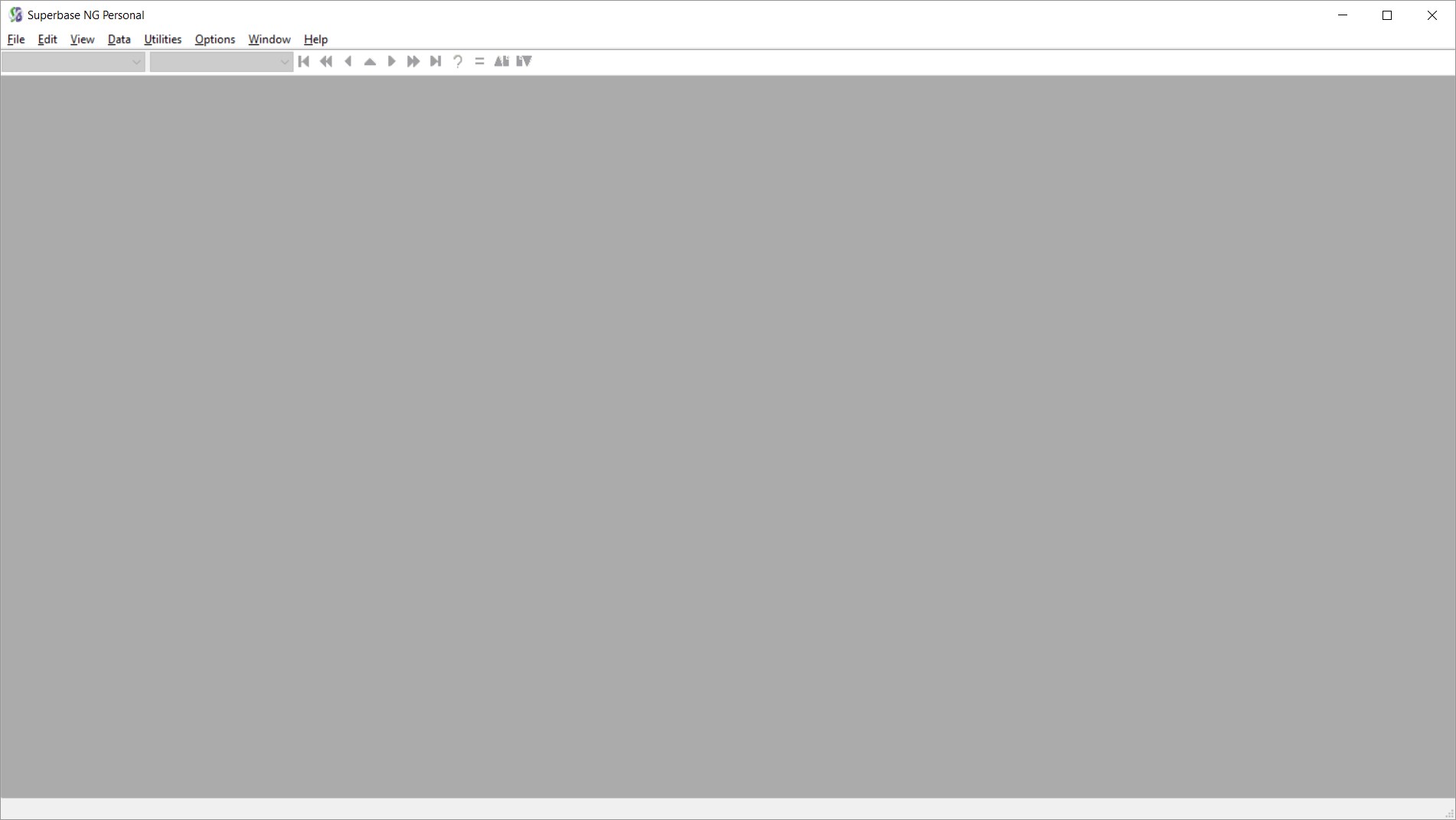
To create the design, start Superbase NG Personal. Once it has started running, it should look something like this
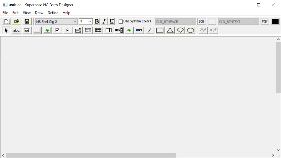
To open the form designer select File -> New -> Form. Once that has been done, the SIMPOL Form Designer will open. It should look something like this:
Setting the Stage
Now that we have a blank form, it is a good idea to set a few default properties and to give the form a preliminary size. To do this either select File -> Page Setup…, or double-click the left mouse button on the form to display the Form and Page Properties dialogue.
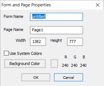
Change both the Form and Page Name to colorlab. You should tick Use System Colors. This will allow the form to inherit the system settings for the colour scheme
| Note |
| It is not necessary to work using this approach. If you want to specifically set the colours used for various parts of the form, feel free to do so. Just realize that users expect their applications to look like the other applications that they use and if they do not, they may react negatively to a program, or consider it to be unprofessional. |
Adding the controls to the form
It is now time to start adding controls to the form. We will start by drawing a text label, this can be done either by selecting the “Draw a label”  button from the toolbar or by going to Draw -> Text, then using the mouse click and drag a rectangular outline. This will cause a Properties dialogue window to show up. For now, just set the Name field to “
lHexColourValue” leaving the rest unchanged.

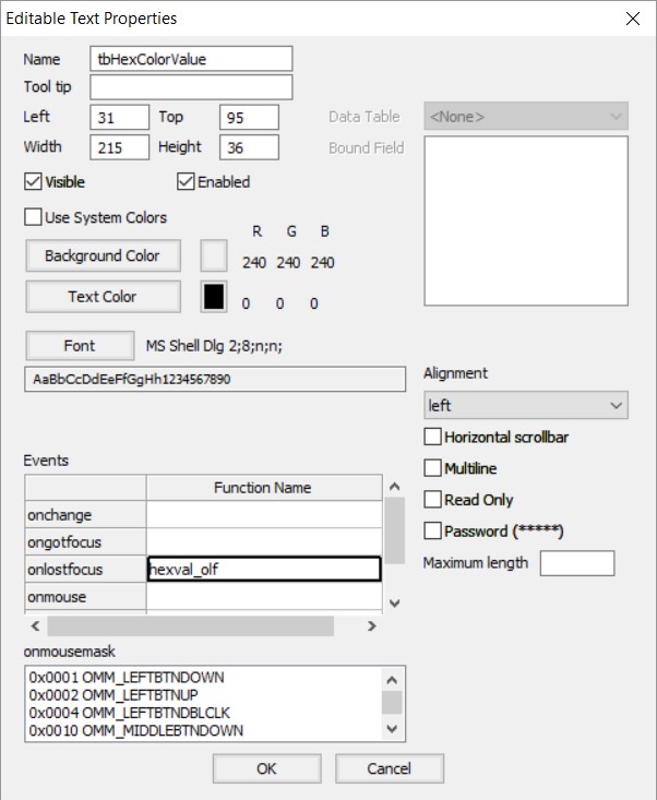
Now add an editable text box to the form, either by pressing the “Draw an editable text box” button  or by selecting Draw -> Editable Text. Set the name to
 tbHexColorValue and in the Events grid, set the value of the onlostfocus Function name entry to hexval_off. This sets the name of the function that is to be called when the event occurs. The dialog box should now look like this:
NOTE:
In the preceding text, the two elements have been assigned the names: lHexColorValue and tbHexColorValue. It isn’t absolutely essential to name the elements of the dialog, the Form Designer will do it for you, but the names won’t be very meaningful. Whenever you expect to actually need to change the content or read the content (or the state – visible, enabled, etc.) or a control, it is a good idea to give it a meaningful name. Also, using a convention for the names will help you remember what type of control you are dealing within the code. A common convention used in the examples is:
| Prefix | Explanation |
| l | Label – used for wxformtext objects |
| tb | Text Box – used for wxformedittext objects |
| b | Button – used for wxformbutton objects |
| bb | Bitmap Button – used for wxformbitmapbutton objects |
| ck | Check Box – used for wxformcheckbox objects |
| ob | Option Button – used for wxformoption objects |
| lb | List Box – used for wxformlist objects |
| cb | Combo Box – used for wxformcombo objects |
| g | Grid – used for wxformgrid objects |
| sb | Scroll Bar – used for wxformscrollbar objects |
| b | Bitmap – used for wxformbitmap objects |
| l | Line – used for wxgraphicline objects |
| r | Rectangle – used for wxgraphicrectangle objects |
| t | Triangle – used for wxgraphictriangle objects |
| a | Arc – used for wxgraphicarc objects |
| e | Ellipse – used for wxgraphicellipse objects |
You may notice that some of the values are used more than once, such as b for both bitmaps and buttons. Although it may seem like it could be confusing, in practice the name that goes with the type identifier tends to make a clear distinction. It is also a good practice to use the same base name for a label and an edit control that are meant to go together, like in the example above.
Now we can add more labels and edit there controls in above style convention for the decimal colour value (use the nameDecColorValue), red (Red), green (Green), and blue (Blue) color values
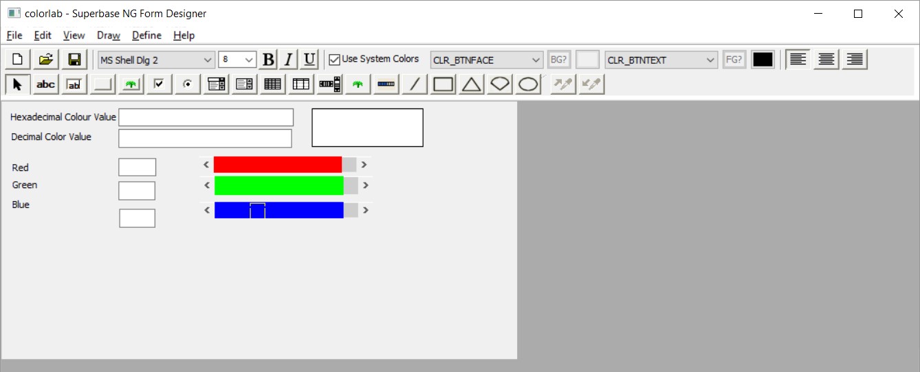
Now add some more labels and edit controls for the decimal colour value, and the red, green, and blue colour values. The resulting form looks like this so far:

The form isn’t particularly pretty yet, but before we do any cleanup we will put in the rest of the controls on the form. To make things visually more interesting for the user we will use three horizontal scroll bars as an additional way of controlling the three colour components. Select the scroll bar tool  or go to Draw -> Scrollbar. Drag a horizontal rectangle on the form and then set the properties in the dialogue as follows:
| Name | sbRed |
| Background Color | 255 R 0 G 0 B |
| Orientation | horizontal |
| Range | 256 |
| Position | 255 |
| Page size | 16 |
| onscroll Function Name | redscroll_os |
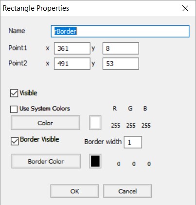
Now do the same for the green and blue scrollbars. Once they are on the form add a rectangle (this will show the actual color value. To do this, select the rectangle tool  or go to Draw -> Rectangle. Set the Properties to those shown below:
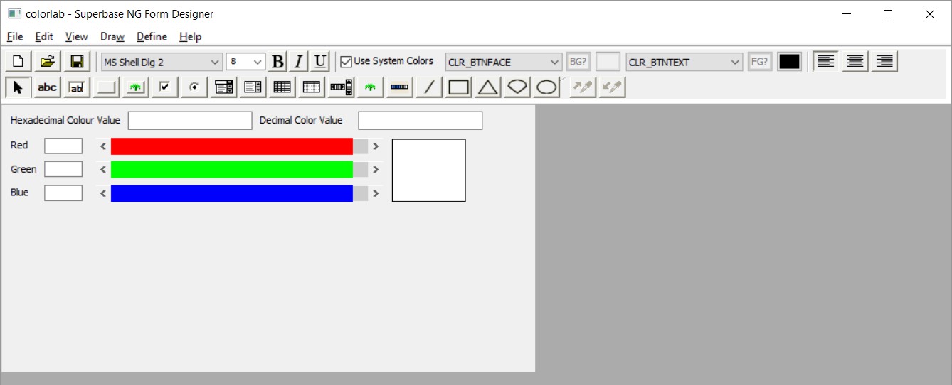
Now that we have added much of the form content, let’s take a look at the current state of our form.
Cleaning things up
The form is now looking alright but still doesn’t have a very clean design. To do this we are going to first make sure that the labels for red, green, and blue do not take up too much space beyond what they require. Now drag-select the RGB text boxes and move these all to the left. Next, resize the blue scrollbar to take up more of the space that has now been made available.
Now drag-select the other two scrollbars and right-click on the highlighted area. Select Adjust Size -> Same Size, then click on the blue scrollbar you have just resized. They are now the correct size but not in the correct place. To adjust this you again highlight the two scrollbars and then select Align -> Horizontally -> left and again click on the blue scrollbar. Repeat this process with the Textboxes and Text for red, green, and blue. Using the resizing, distribution and alignment tools rearrange the form to look something like this
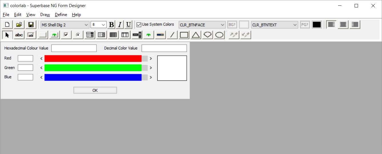
The form is nearly finished. The last thing to add is an OK button as an alternate way of closing the program. This should be named bOK and have the onclick Function of okbtn_oc. Also, we should resize the form to fit around the contents without a lot of extra space. The final resulting form looks like this:
Saving the form
To save the form in a format which can be reopened and modified, select File -> Save As -> Form… Save the form as colorlab_form.sxf in the source directory of the project we created earlier.
For this project, we are going to use the form as source code, so let’s also save it as SIMPOL source code. To do so, select File -> Save As -> wxform Program. Save the program as colorlab_form.sma This should also be saved in the source directory for our project.
That is the design portion of this project done and Superbase NG Personal can now be closed